Is Ultramarine a Cool Blue?
By Bob Bahr
I have shared this article from the outdoorpainter.com
It is a topic I found fascinating. Personally I think Ultramarine is a warm blue that can be used as a cool shadow. I would love to hear your thoughts on the subject in comments.
Particularly in plein air painting, where carrying a lot of paint tubes around and having a complex palette is often avoided, artists go for a split-primary palette, with a warm and cool for each primary color. So what is your warm blue?
Many people would name ultramarine blue. But when Mark Kevin Gonzales(1) was asked by a student at the Art Students League of New York if ultramarine is indeed a warm blue, he fell down a very strange rabbit hole.
“I had no idea about this debate until last week,” says Gonzales. “A student here said she had seen on Gamblin Artist’s Colors’ website that ultramarine blue was a warm blue. She was surprised because she has always thought it was a cool color. She even asked her teacher here at the Art Students League, and he agrees with her that it is cool. I was surprised and wondered how many other artists thought. So I started asking students and teachers their ideas on the matter. And I was surprised at some of the results.”
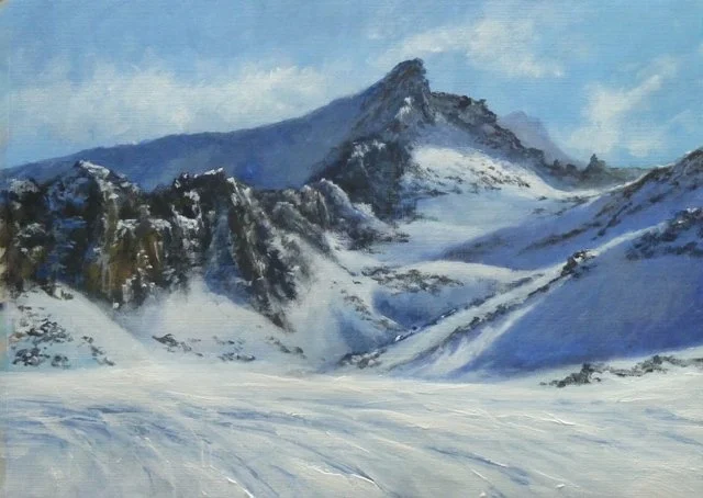
Off Piste by Denise Allen
Just counting teachers, Gonzales scores it at 20 to 10 votes, with the warm contingent winning. But if that many professional art instructors feel differently, there must be more here than just a black-and-white answer. We asked Scott Gellatly, the product manager for Gamblin, to help explain what might be going on.
“The ‘coolest’ spot on the color wheel is a middle blue (i.e., cobalt blue),” Gellatly asserts. “Once you move around the perimeter of the color wheel from this point, colors get warmer — as you move toward either red or yellow. So, ultramarine blue is warmer (more violet), as is manganese blue (more green). Across the ‘coolest’ spot on the color wheel is the ‘warmest’ spot, being a middle orange. Hence, adding orange to blue not only lowers the chroma, but makes it warmer as well.”
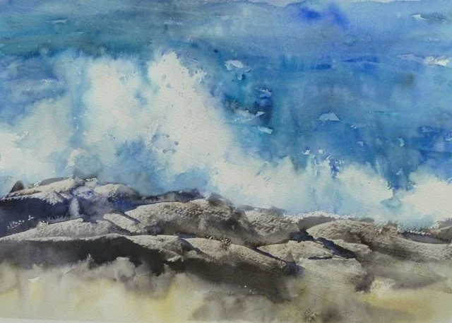
Splash by Denise Allen
Gellatly adds, “Ultramarine blue is indispensable for skies, water, and atmosphere.”
Gonzales came to the same conclusion, and applied a bit of psychology to the issue, as well.
“What I think is that the two schools of thought about blue separate like this: The people who see ultramarine blue as cool have a yellow bias, and the people who think ultramarine blue is warm have a red bias,” Gonzales says. “Some argue that as blue goes toward green it is closer to the warm colors, closer to yellow. And almost all of those who said ultramarine blue is warm say there is red in it, so they have a red bias. The warm ultramarine blue people believe that the blues toward green are cooler and the cool ultramarine blue people think the blues with less yellow are cooler.

Port Soller Majorca by Denise Allen
“So for the cool side, cobalt is warmer than ultramarine blue, and cerulean is warmer than cobalt, and vice versa for the warm ultramarine blue people. A few of the landscape painters say the cool colors recede, and ultramarine blue recedes more than a color closer to yellow. However, one landscape painter says cool greens recede more than reddish blues. He also said he thinks of blues as red-blues and yellow-blues.”
Gonzales continues, “The warm ultramarine blue people also say it is an emotional response to color. In my mind I think of how in cartoons when a character got angry, he turned red. Red is associated with quite a number of things, from love to violence. And when I think of cool, I think icebergs and glaciers. And in my mind — though it might not be true— as light would go through a glacier, it looks like a blue green color. On the light spectrum red has the longest wavelength and violet has the shortest, but as I have said, warm and cool in terms of color is an emotional response to color, not scientific. Most of the teachers I talked to are stunned that there are two views on ultramarine blue. I’m a warm ultramarine blue guy, but I can see the other side’s point of view, and I will never look at blue the same way again.”
There you are. It’s as clear as the blue sky.
(1) https://www.markgonzalesfineart.com/