Painting waves
Waves.
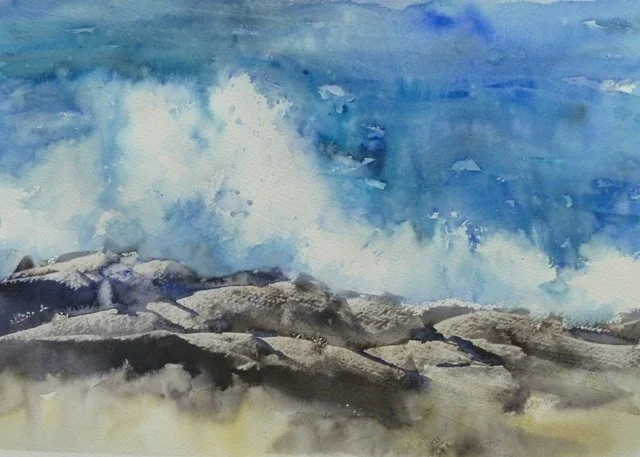
Painting waves is a challenge, but a really fun challenge. Planning is the key to making this easier. I paint both watercolour and acrylic seas.
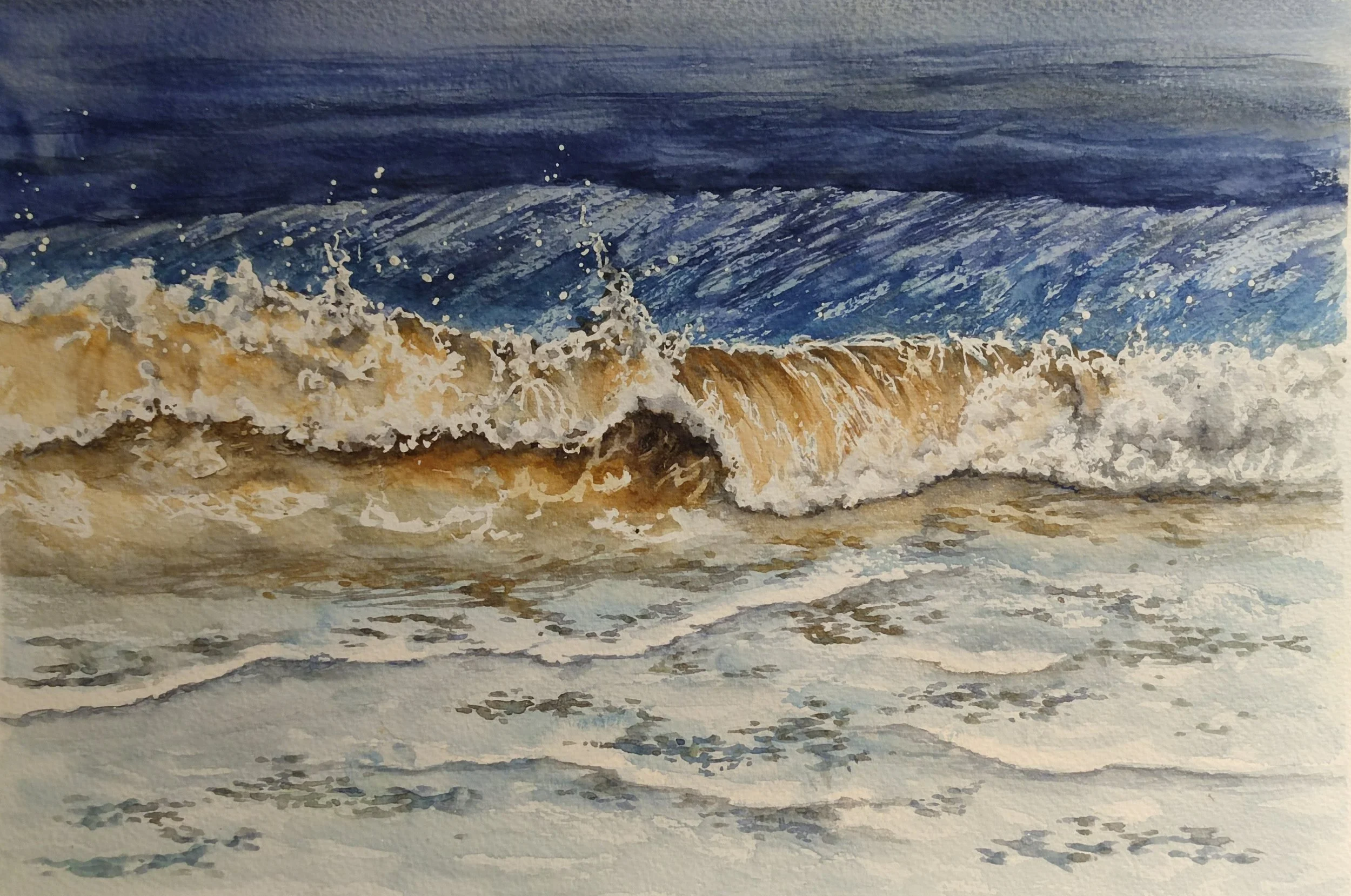
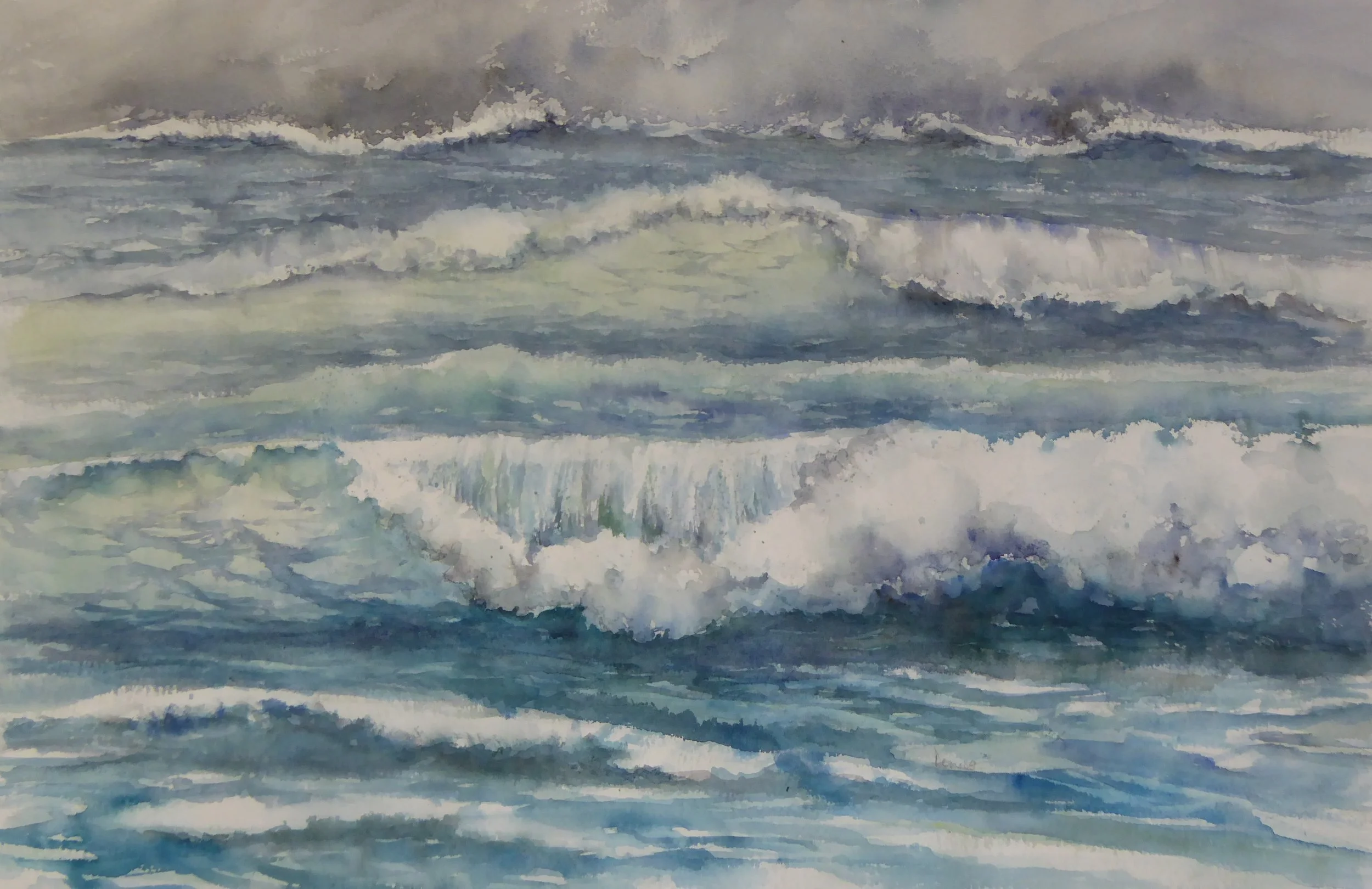
There are 2 main techniques for painting the froth on waves in watercolour. Firstly using a resist, either masking fluid or a wax or oil pastel. Masking out the areas you wish to remain white. Then you can paint the rest of the waves.
Watercolour waves using masking fluid.
If you have used oil pastels, then this is done. If you have used masking fluid, you can then remove it before roughing a few edges and adding a few shadows.
Watercolour with oil pastel resist.
The alternative is simply avoid painting the areas you wish to remain white. This requires planning and care, but gives a fresh and bright finish.
Watercolour carefully avoiding painting the white areas.
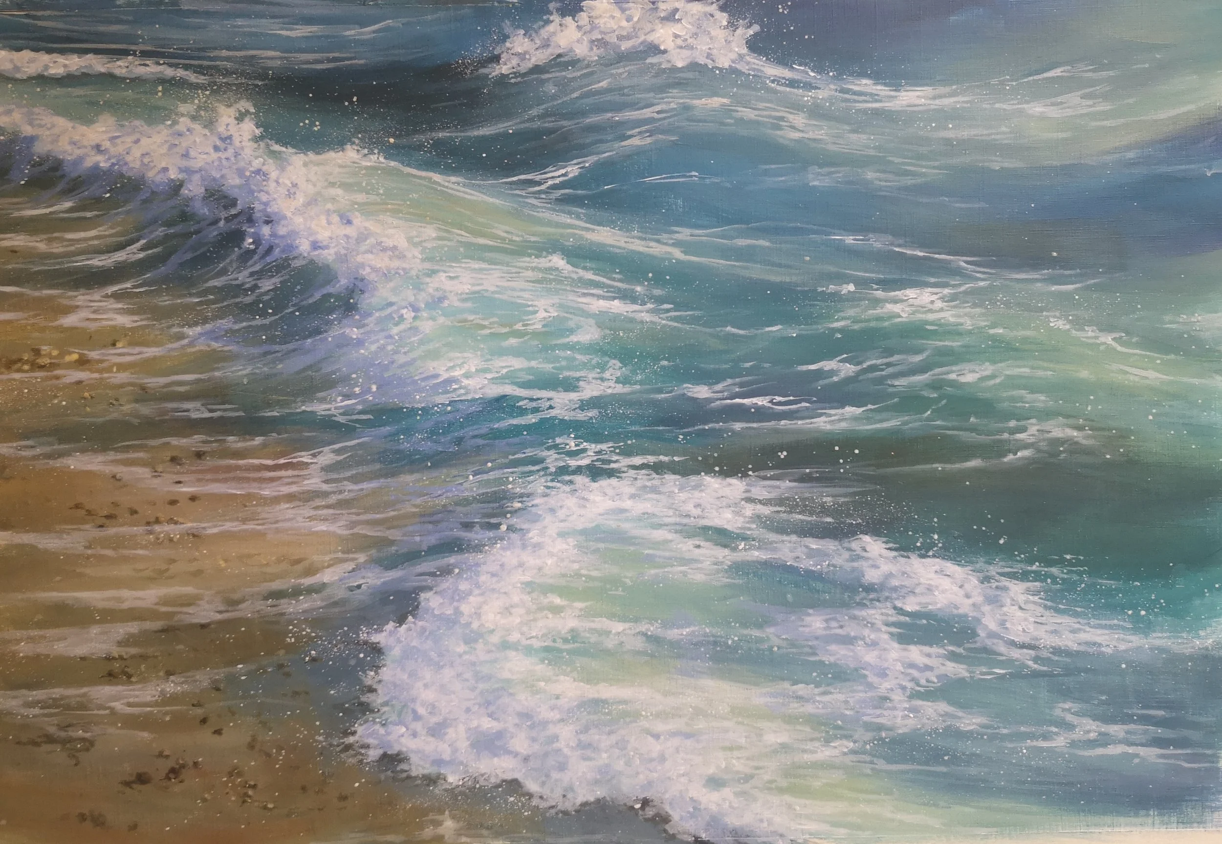
Acrylic waves are a different game altogether. Here you work from dark to light, creating the shape of the waves first before adding the froth and foam.
Acrylic adding the white last.
I have demos of all these techniques on my youtube channel where you will find a whole playlist for seas rivers and lakes. youtube.com/artydenise
Is Ultramarine a Cool Blue?
By Bob Bahr
I have shared this article from the outdoorpainter.com
It is a topic I found fascinating. Personally I think Ultramarine is a warm blue that can be used as a cool shadow. I would love to hear your thoughts on the subject in comments.
Particularly in plein air painting, where carrying a lot of paint tubes around and having a complex palette is often avoided, artists go for a split-primary palette, with a warm and cool for each primary color. So what is your warm blue?
Many people would name ultramarine blue. But when Mark Kevin Gonzales(1) was asked by a student at the Art Students League of New York if ultramarine is indeed a warm blue, he fell down a very strange rabbit hole.
“I had no idea about this debate until last week,” says Gonzales. “A student here said she had seen on Gamblin Artist’s Colors’ website that ultramarine blue was a warm blue. She was surprised because she has always thought it was a cool color. She even asked her teacher here at the Art Students League, and he agrees with her that it is cool. I was surprised and wondered how many other artists thought. So I started asking students and teachers their ideas on the matter. And I was surprised at some of the results.”
Off Piste by Denise Allen
Just counting teachers, Gonzales scores it at 20 to 10 votes, with the warm contingent winning. But if that many professional art instructors feel differently, there must be more here than just a black-and-white answer. We asked Scott Gellatly, the product manager for Gamblin, to help explain what might be going on.
“The ‘coolest’ spot on the color wheel is a middle blue (i.e., cobalt blue),” Gellatly asserts. “Once you move around the perimeter of the color wheel from this point, colors get warmer — as you move toward either red or yellow. So, ultramarine blue is warmer (more violet), as is manganese blue (more green). Across the ‘coolest’ spot on the color wheel is the ‘warmest’ spot, being a middle orange. Hence, adding orange to blue not only lowers the chroma, but makes it warmer as well.”
Splash by Denise Allen
Gellatly adds, “Ultramarine blue is indispensable for skies, water, and atmosphere.”
Gonzales came to the same conclusion, and applied a bit of psychology to the issue, as well.
“What I think is that the two schools of thought about blue separate like this: The people who see ultramarine blue as cool have a yellow bias, and the people who think ultramarine blue is warm have a red bias,” Gonzales says. “Some argue that as blue goes toward green it is closer to the warm colors, closer to yellow. And almost all of those who said ultramarine blue is warm say there is red in it, so they have a red bias. The warm ultramarine blue people believe that the blues toward green are cooler and the cool ultramarine blue people think the blues with less yellow are cooler.
Port Soller Majorca by Denise Allen
“So for the cool side, cobalt is warmer than ultramarine blue, and cerulean is warmer than cobalt, and vice versa for the warm ultramarine blue people. A few of the landscape painters say the cool colors recede, and ultramarine blue recedes more than a color closer to yellow. However, one landscape painter says cool greens recede more than reddish blues. He also said he thinks of blues as red-blues and yellow-blues.”
Gonzales continues, “The warm ultramarine blue people also say it is an emotional response to color. In my mind I think of how in cartoons when a character got angry, he turned red. Red is associated with quite a number of things, from love to violence. And when I think of cool, I think icebergs and glaciers. And in my mind — though it might not be true— as light would go through a glacier, it looks like a blue green color. On the light spectrum red has the longest wavelength and violet has the shortest, but as I have said, warm and cool in terms of color is an emotional response to color, not scientific. Most of the teachers I talked to are stunned that there are two views on ultramarine blue. I’m a warm ultramarine blue guy, but I can see the other side’s point of view, and I will never look at blue the same way again.”
There you are. It’s as clear as the blue sky.
(1) https://www.markgonzalesfineart.com/
Sky Arts Landscape Artist of the Year.
My Day as a Wildcard
I applied to take part in the Sky Arts Landscape artist of the year. The process involves sending in an application with an image of one of your paintings. My work is quite diverse, and I found it quite tricky to decide what to send in. In hindsight, and a rather dramatic year later, I can’t actually remember which painting I sent in. After several months of waiting, I received an email to say I had not been picked. I was however invited to apply for the wildcard section. You have to have applied to the main show in order to take part in the wildcard. At a time and date, you have to send in an email to try to get a place. This time I had more success and managed to get accepted.
There would be 50 wildcards in my episode, so it would be busy. Especially as we were just coming out of the first lockdown and would all have to keep distanced.
My episode was to take place at West Wycombe Park in Buckinghamshire. The episodes are traditionally filmed at National Trust properties and parks. This generally offers magnificent parklands and classical buildings to paint. I was asked to arrive at 7am. This was going to be a long day. As a wildcard we would have to be totally self-sufficient. Due to the covid restrictions, there would be no café on site, not even anywhere to get a drink. We would have to take all painting stuff, chair, rain protection, food, drink and anything else we might need. There would also be no transport from the car park to the painting site so we would have to be able to carry everything.
On arrival at the car park it was already busy, and registration was under way. There was a huge variety of trolleys, festival trolleys, straps, backpacks and even a push chair. I decided to register before loading myself up. Registration involved getting a stamp on the back of your canvas or paper with the Sky Arts logo to confirm you had not prepared anything in advance. I got out of the car and had my first challenge. My knicker elastic went ping. I was wearing trousers, which fortunately held things up. This was going to be a challenging day. Thankfully, it was a glorious day, and no rain was forecast. One less stress to deal with.
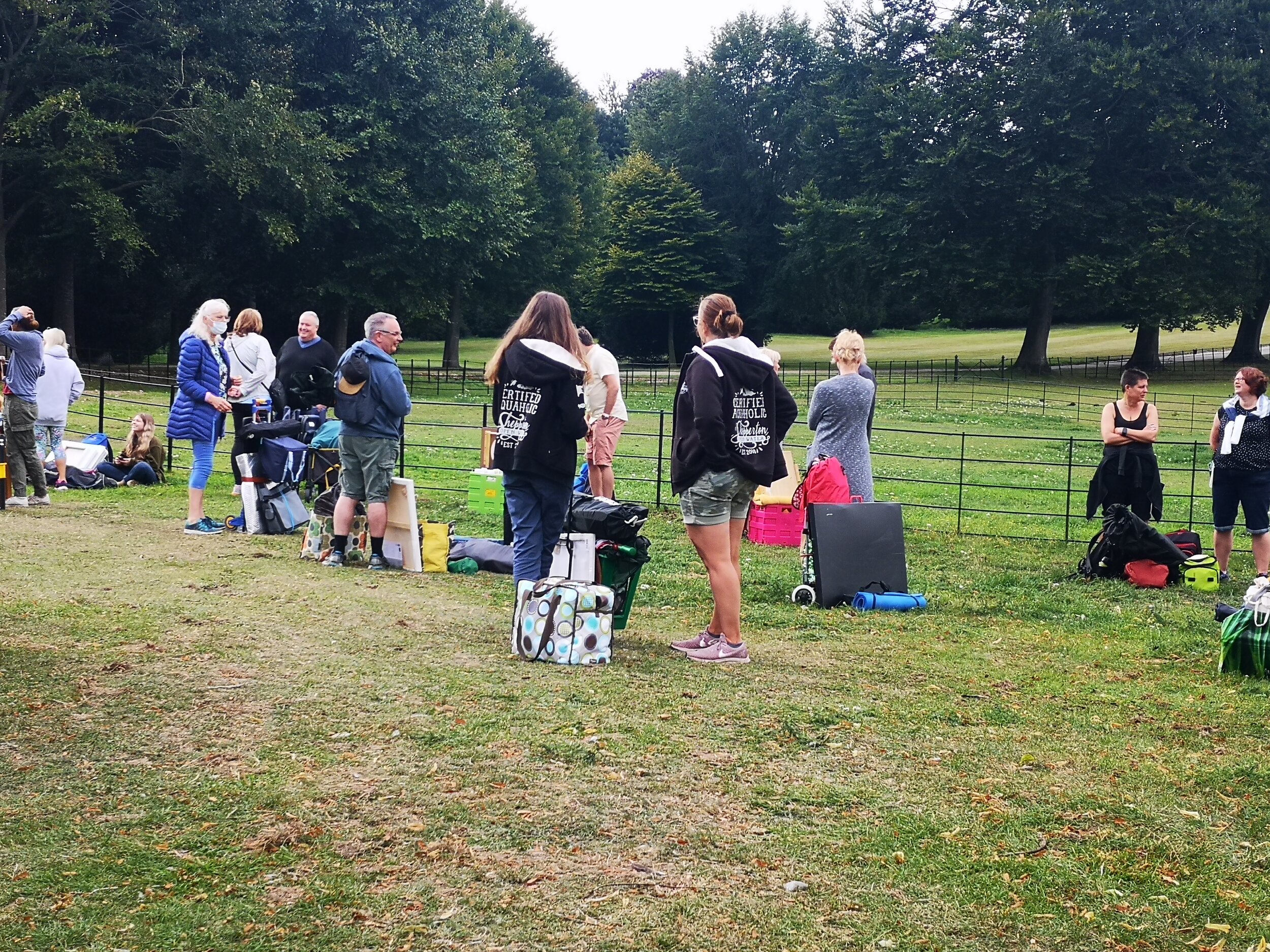
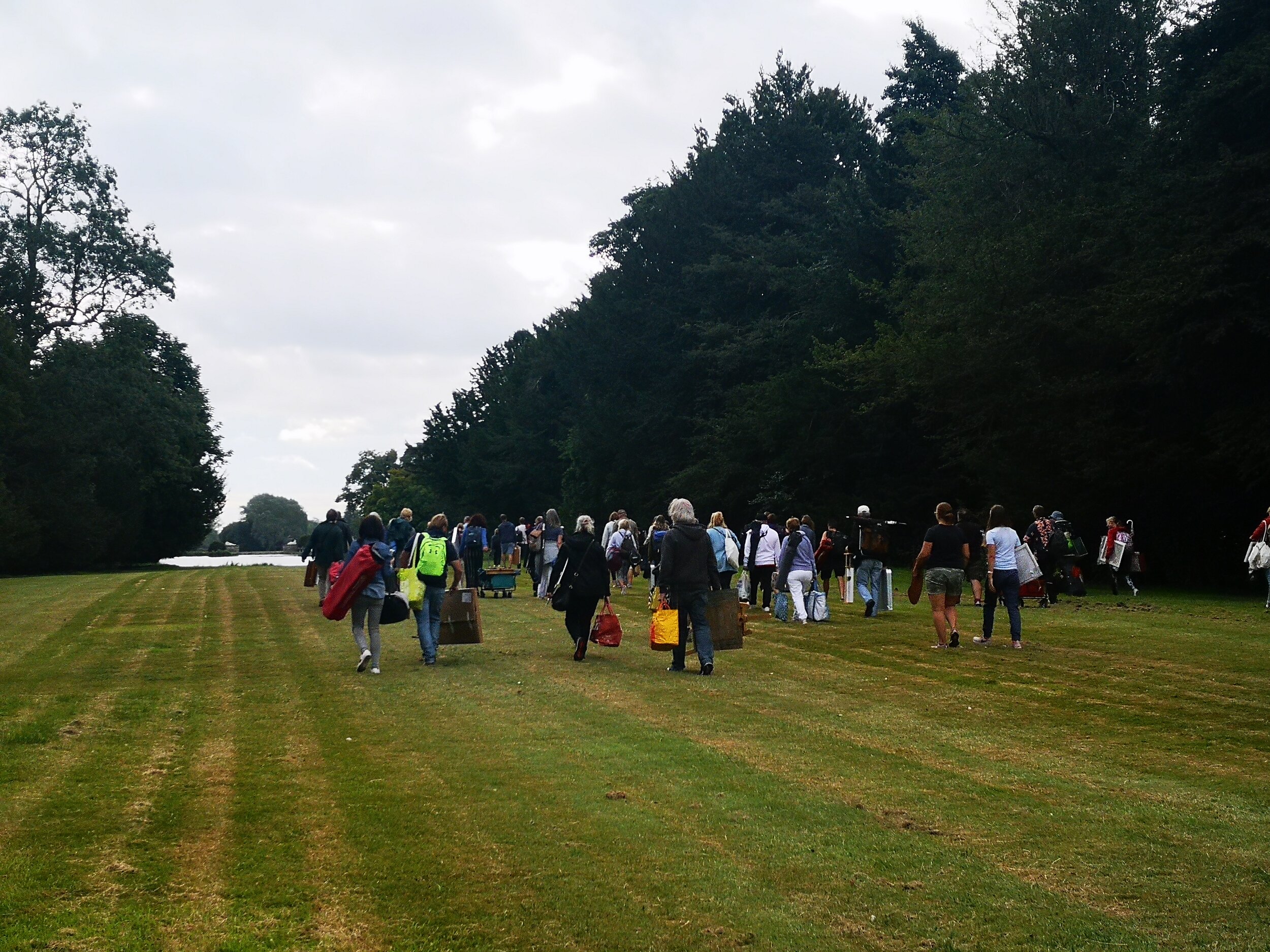
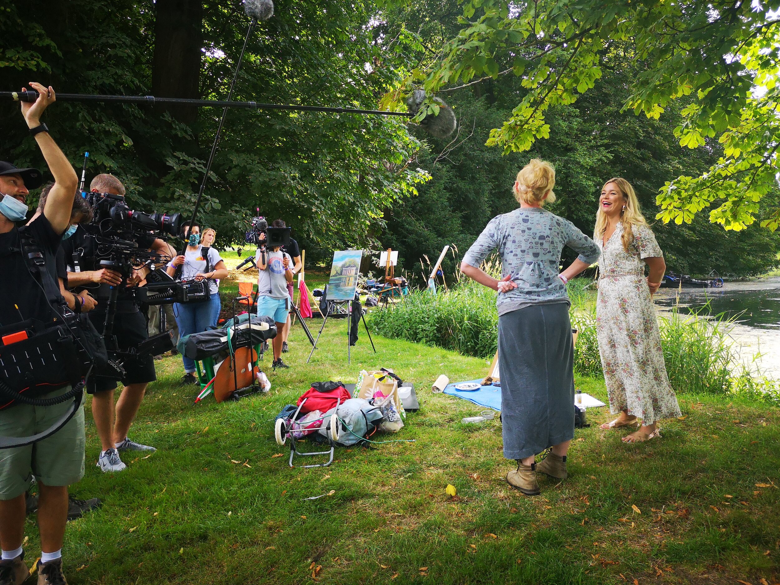
Registration complete, and everything strapped to my trolley, we had to wait until everyone was there so we could all be escorted together to the wild card painting area. It would be about a half mile walk. En route I got chatting to some of the crew. There were many changes to accommodate distancing and sanitation requirements, but everyone was so excited that we were able to go ahead with the recording. It would be different, and have challenges, but we were there and it was happening.
West Wycombe park is a stunning National Trust property with many ornamental buildings, hidden temples and follies. It was a beautiful day, and there were views that could be paintings everywhere.
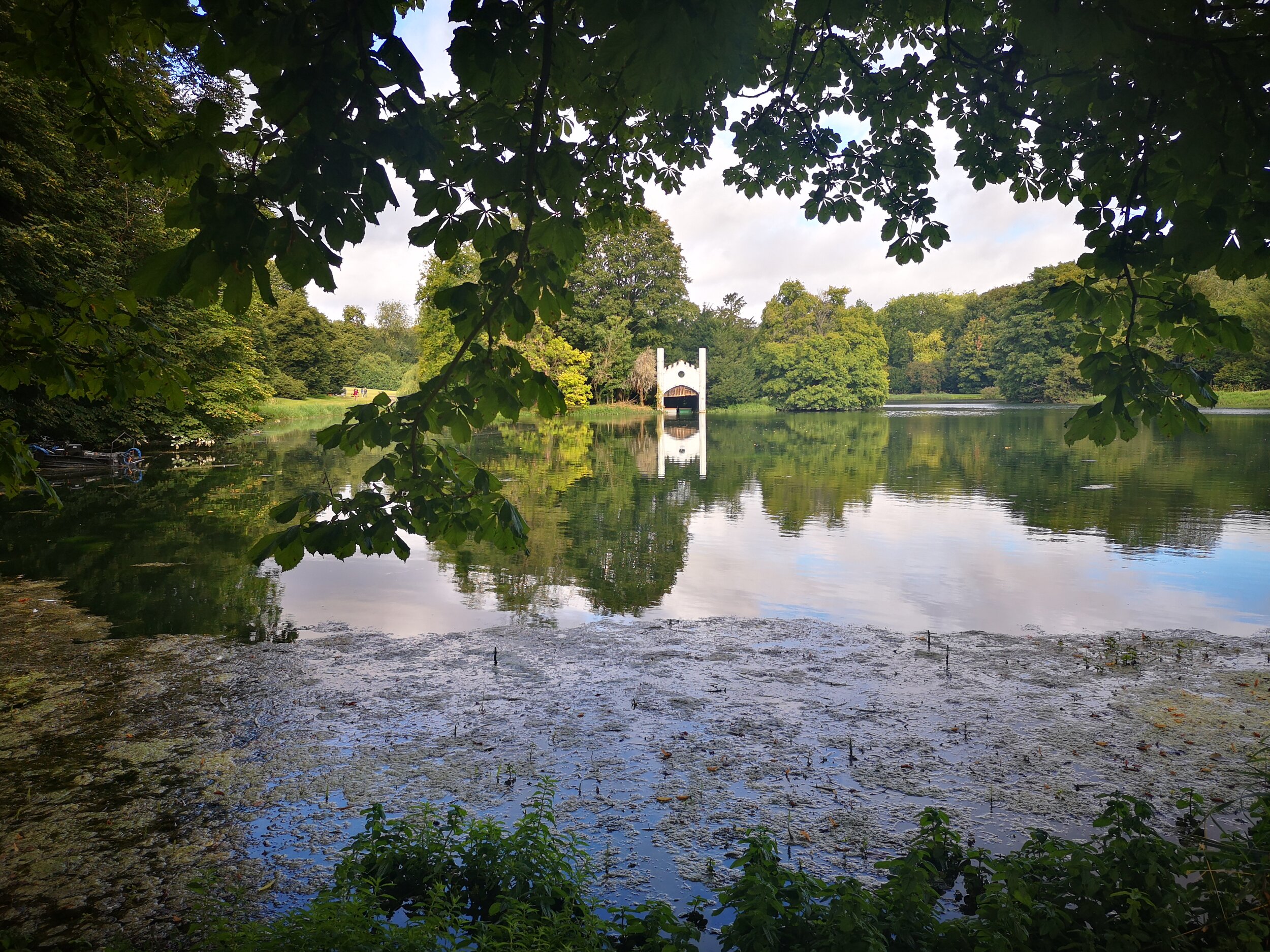
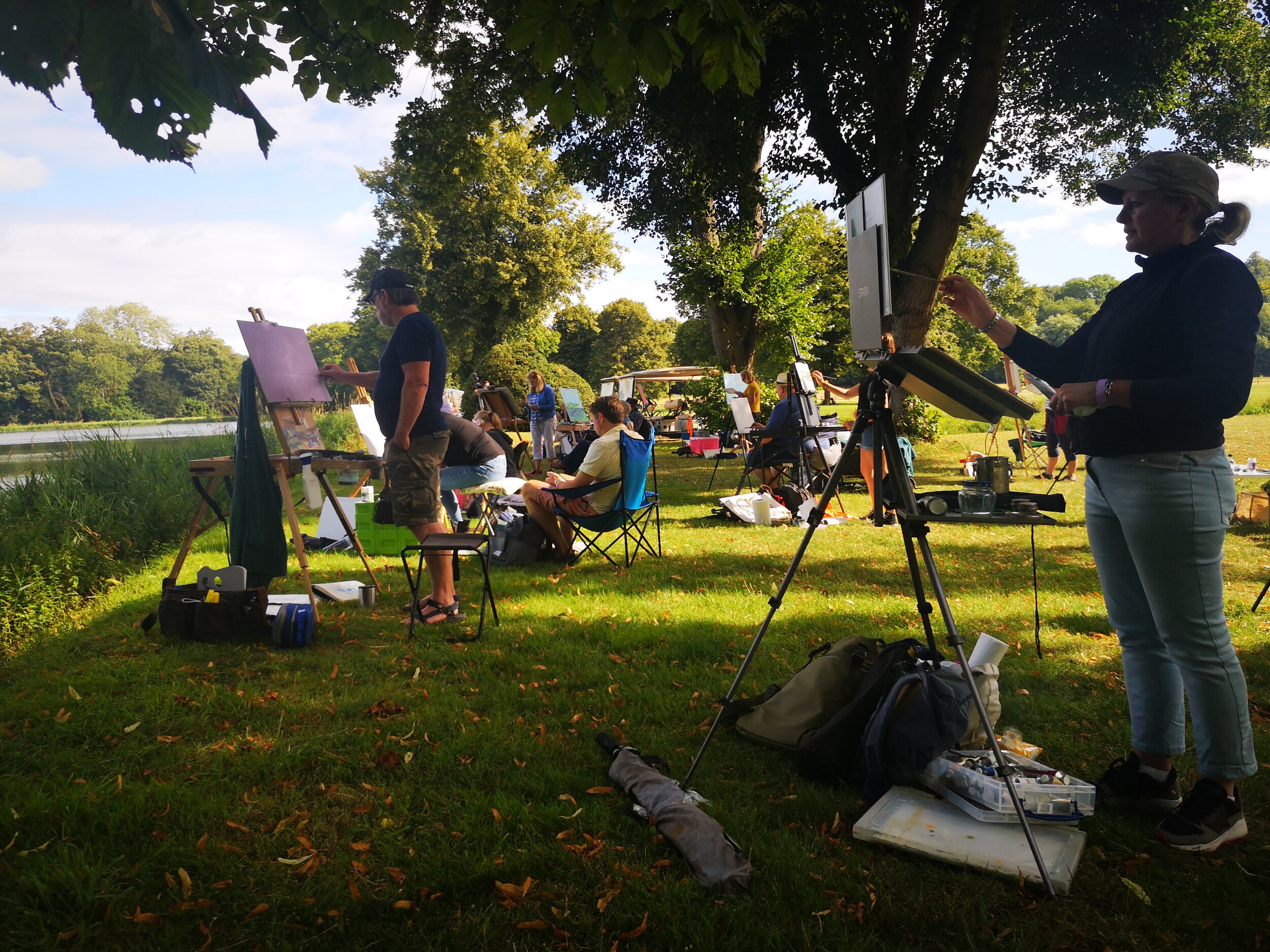
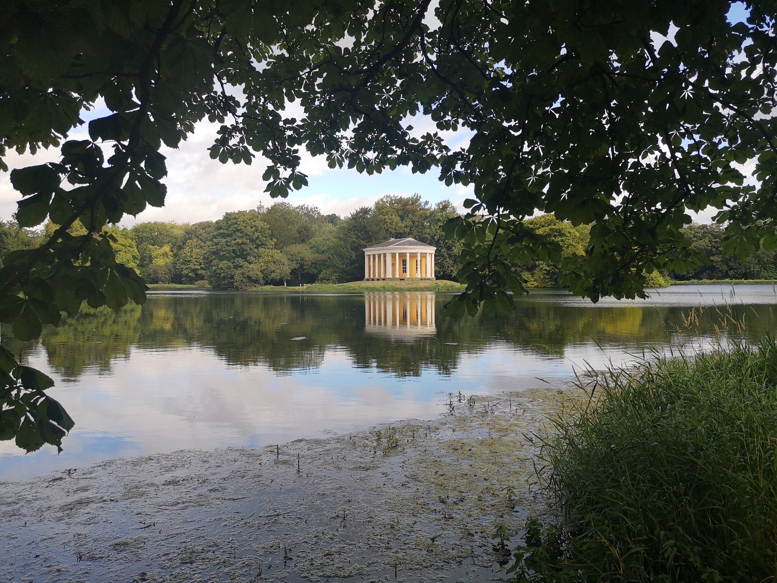
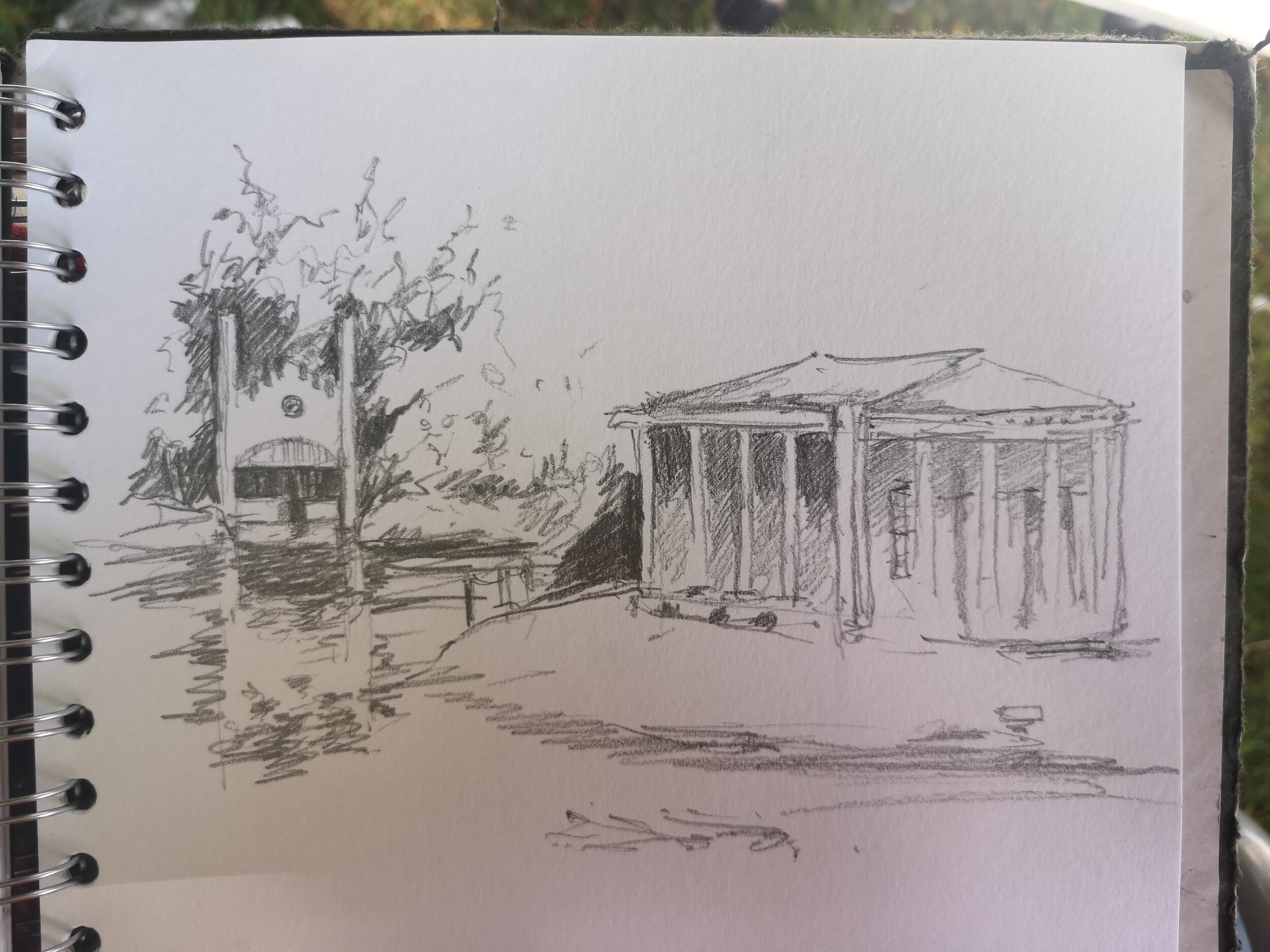
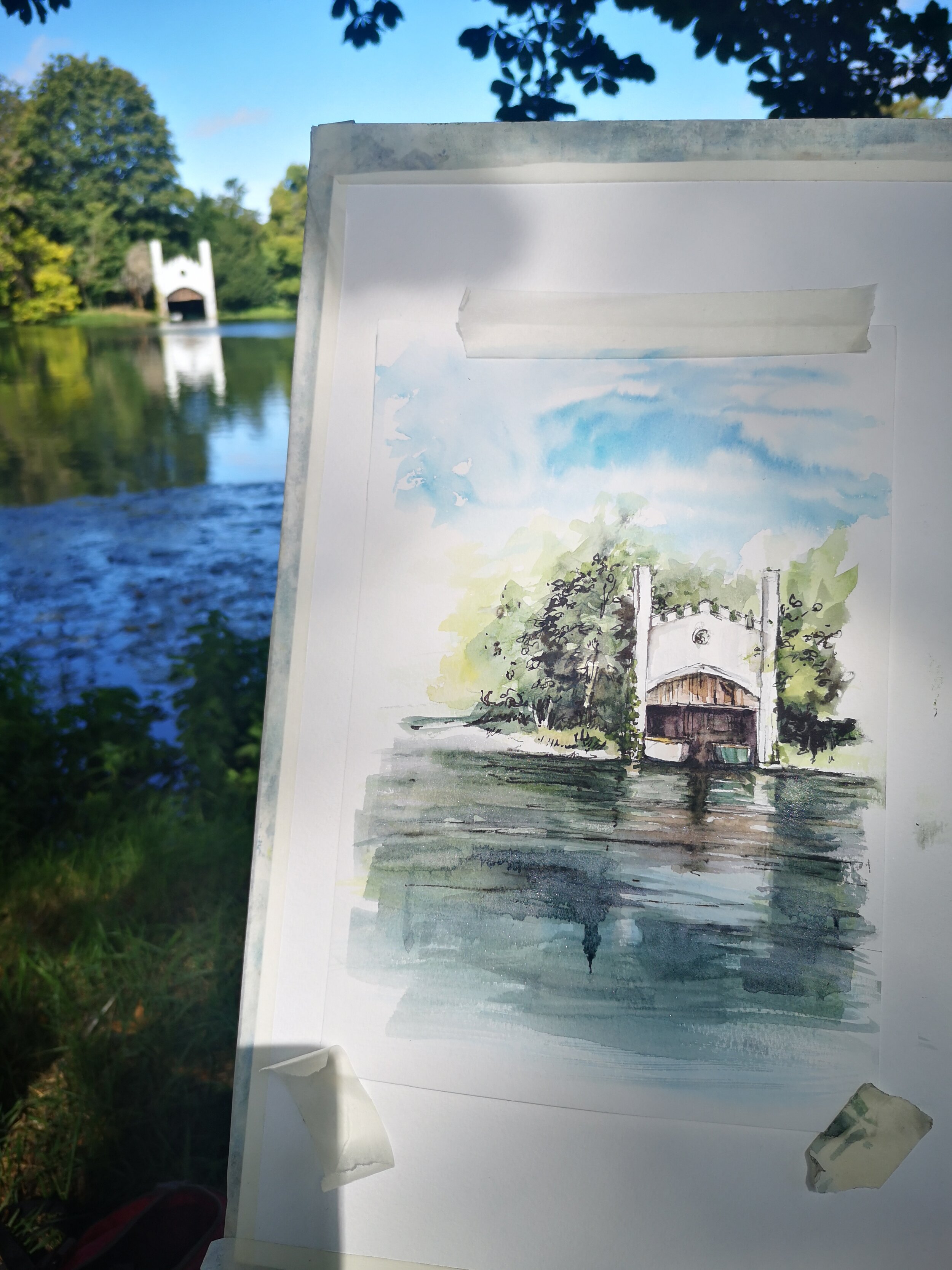
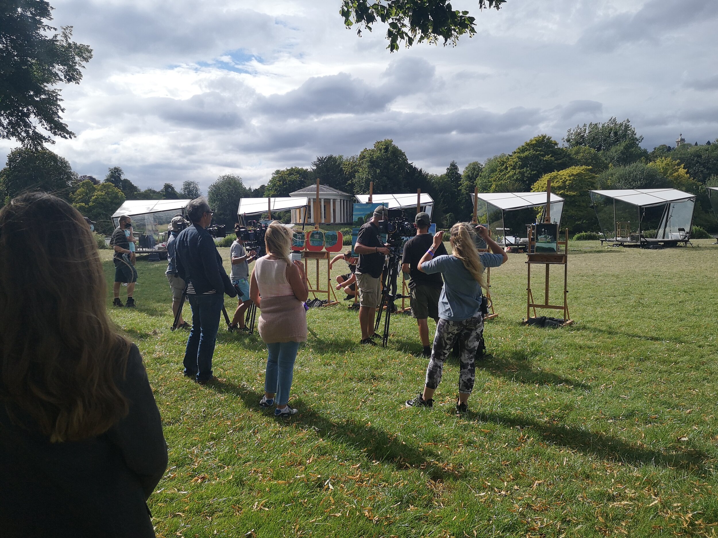
We all scattered around the field we had been allocated, which was next to a lake, with several buildings visible in different directions. I set myself up near the lake, where I could see a lovely boat shack and the music temple, a Doric temple that was used as a theatre. In the distance I could also see the pods where the main contestants were set up.
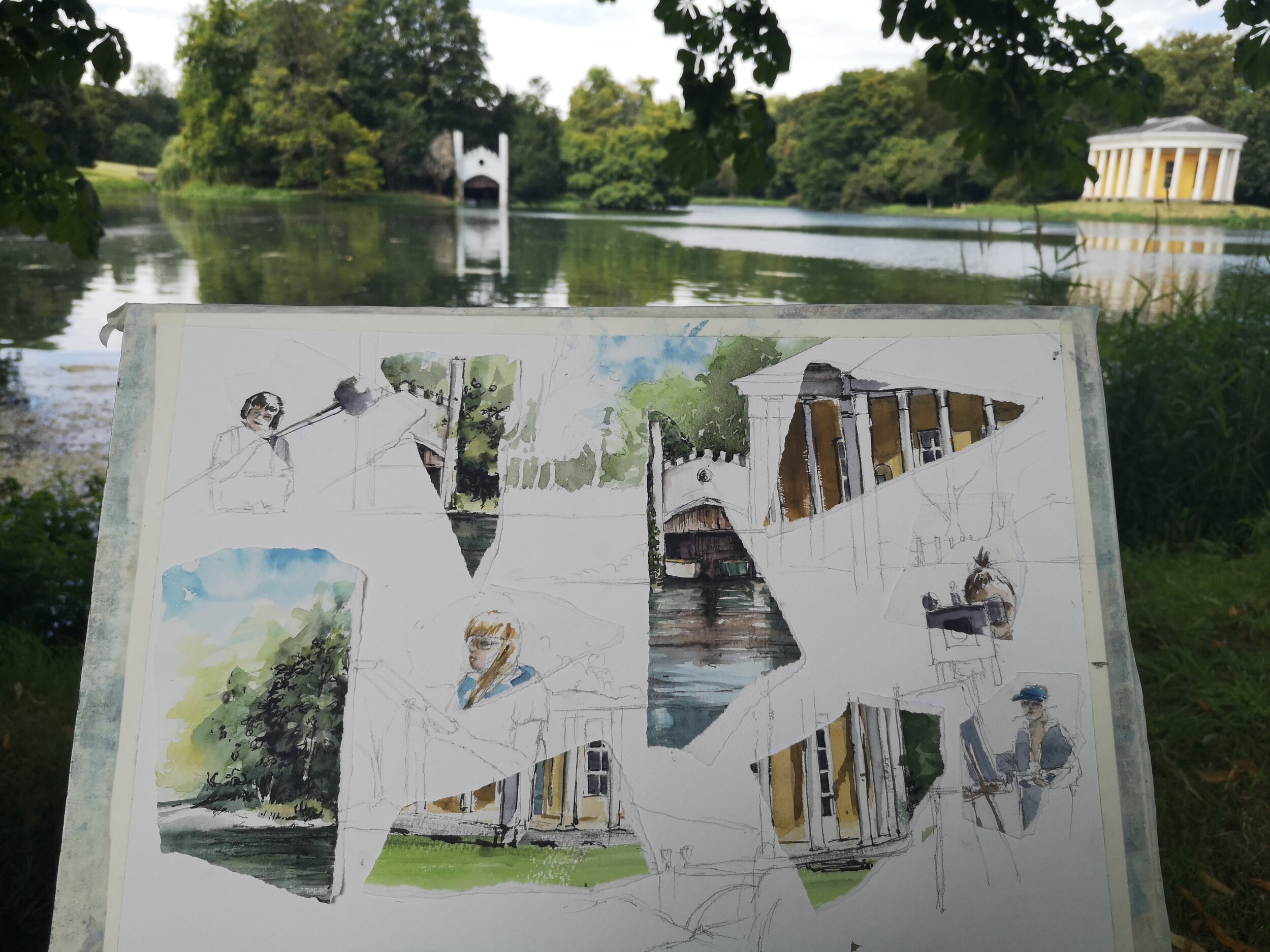
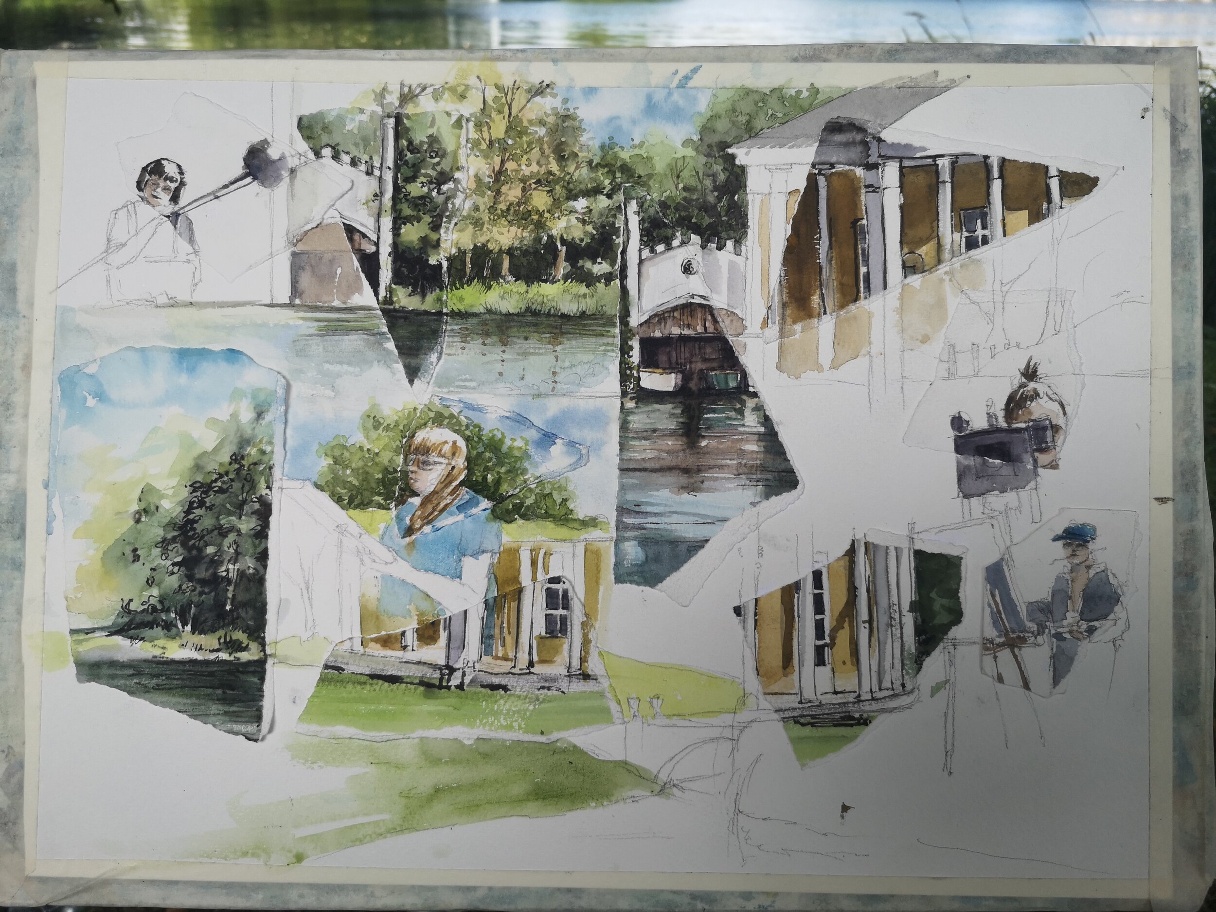
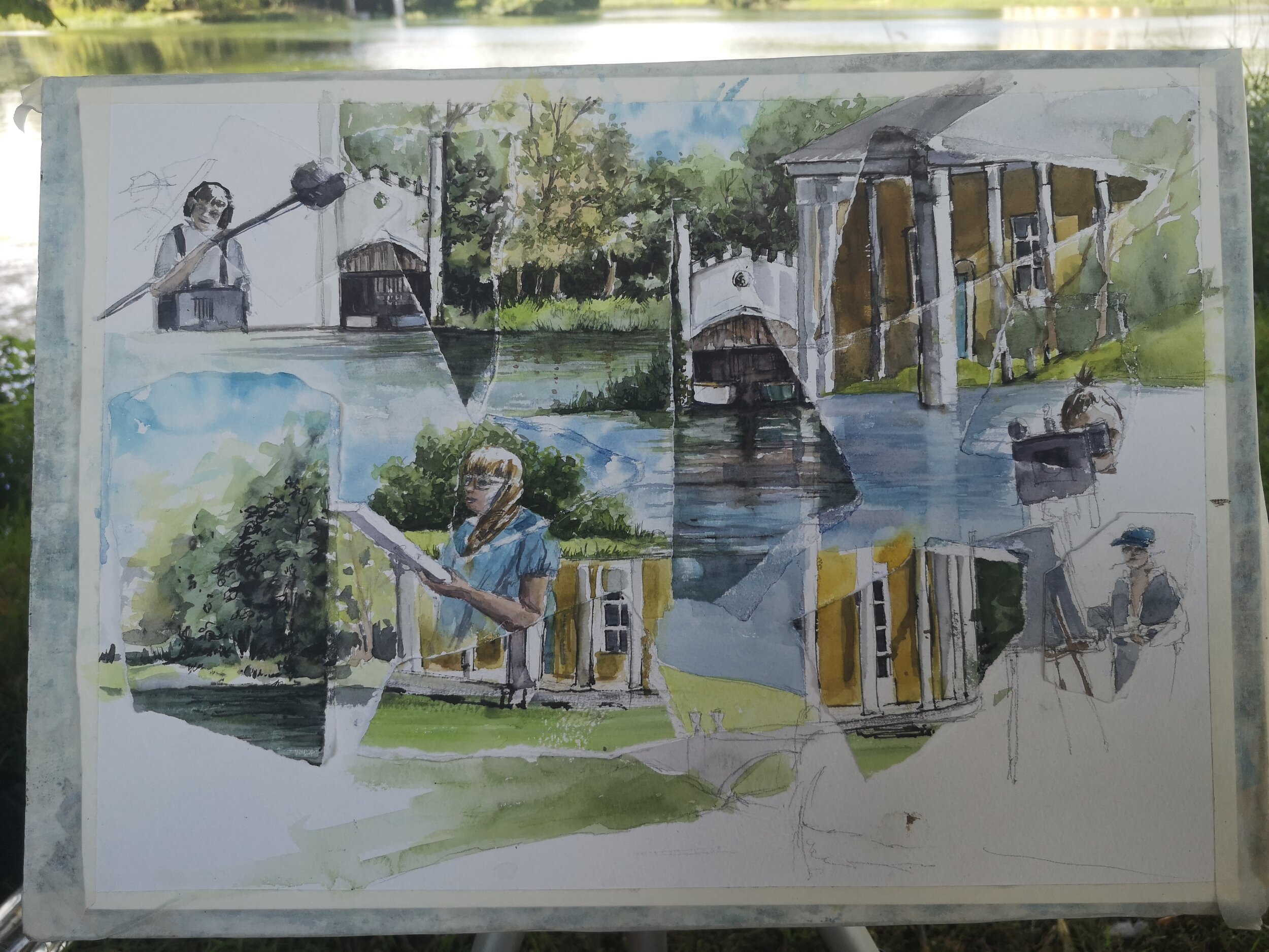
I had made the decision to create one of my deconstruction and reconstruction pieces. These involve painting a number of paintings of different views, then tearing them up before rearranging them on another piece of paper and painting them back together again. It will all make sense as I go along. I started with my sketchbook and sketched a few different views to get an idea of what I was going to do.
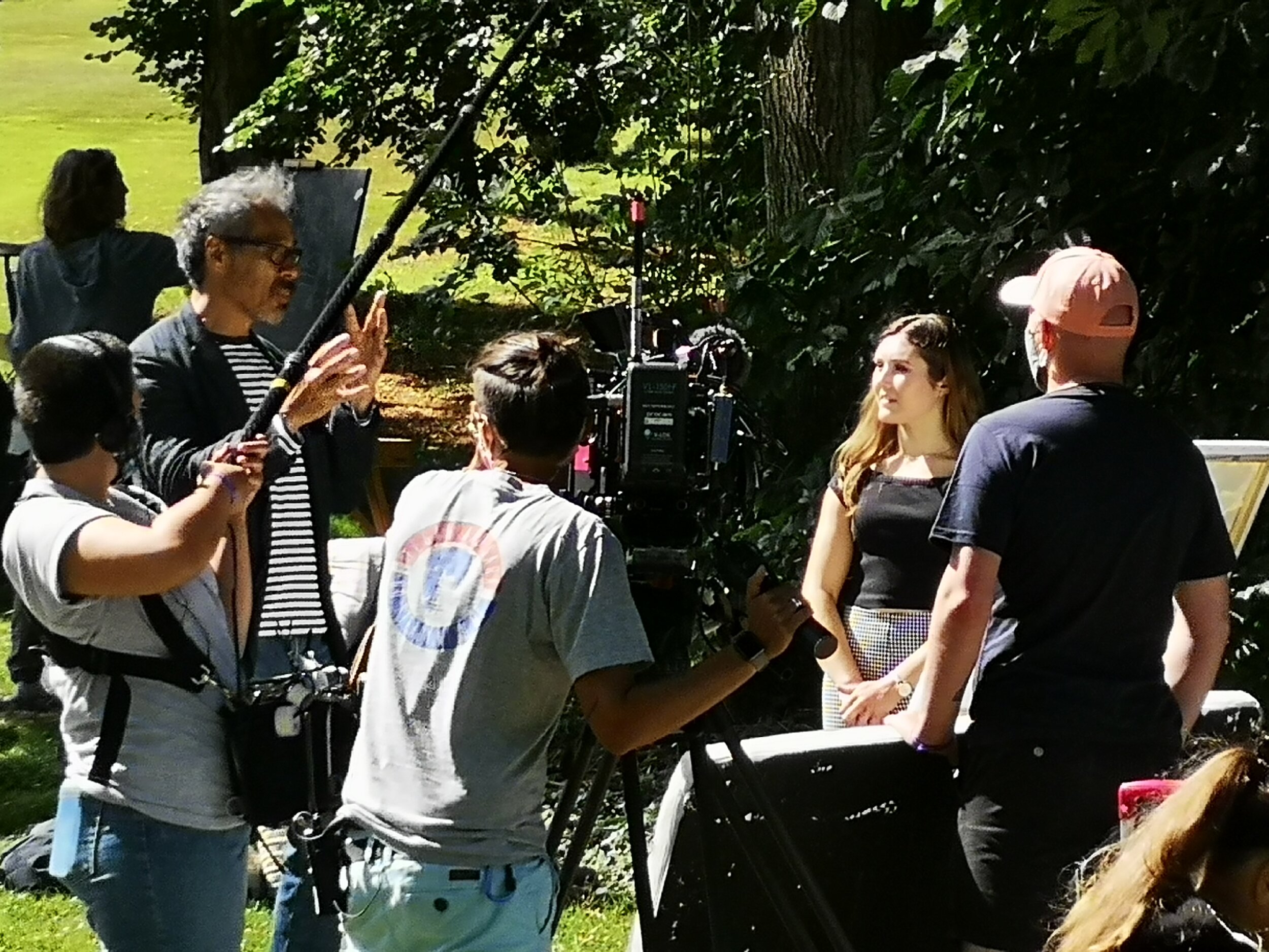
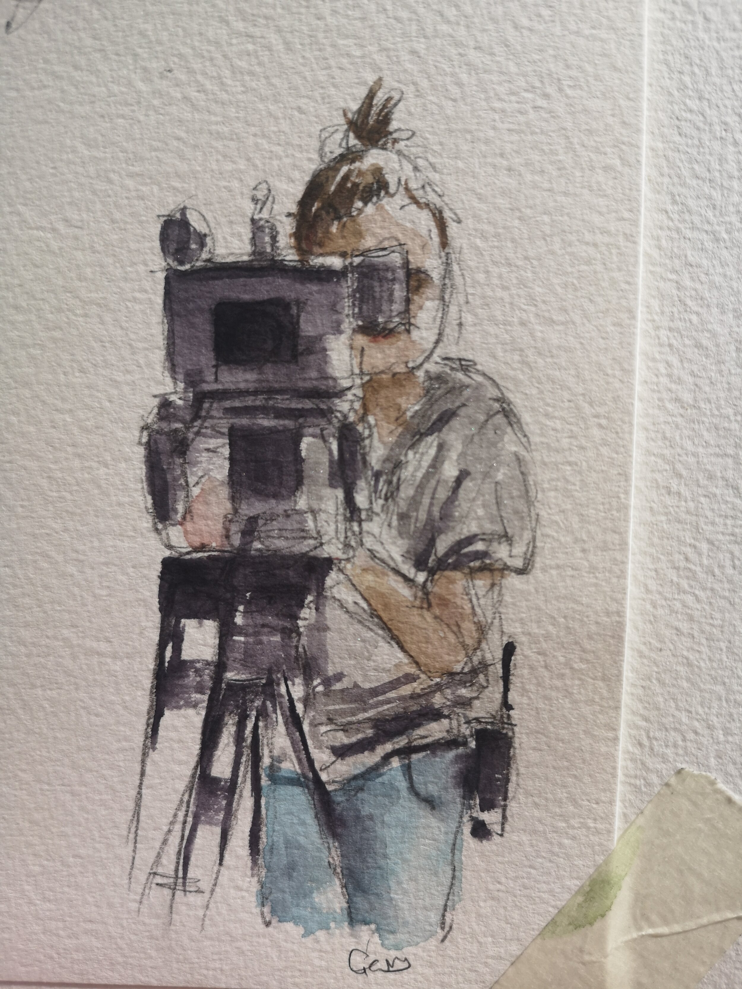
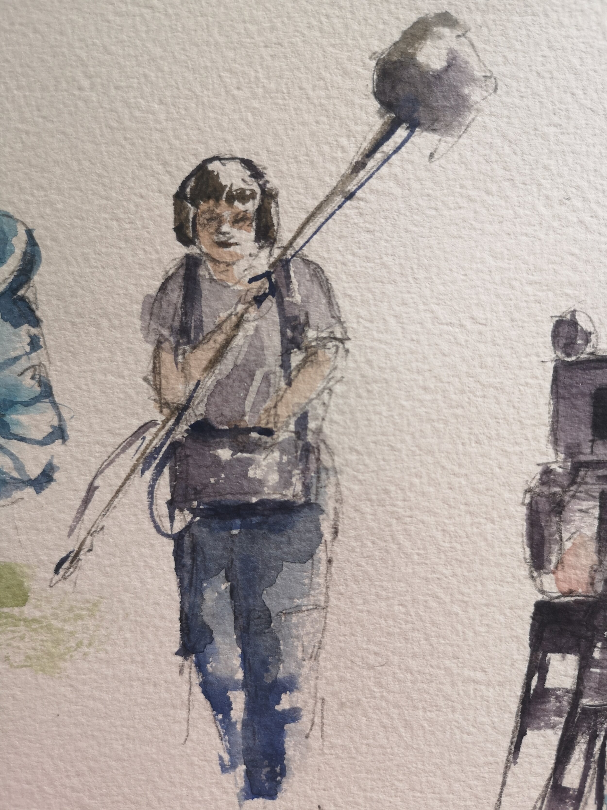
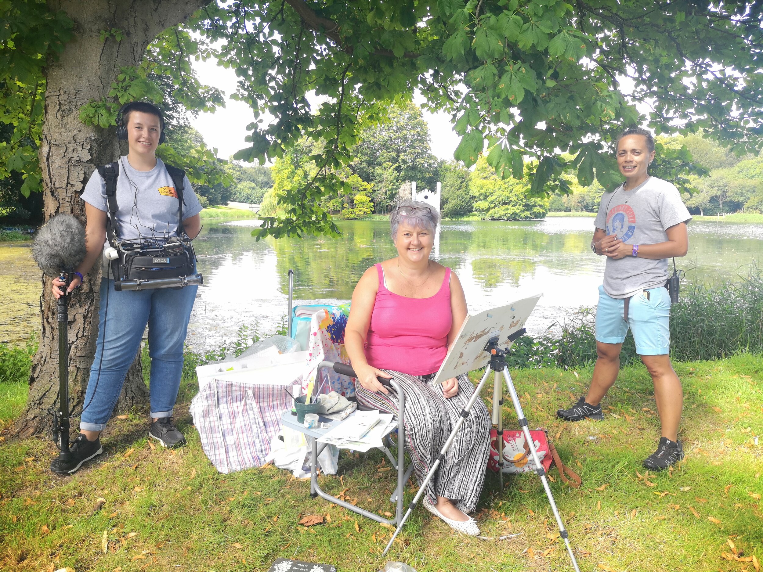
Initially I was drawn to the boat shed with a couple of rowing boats in it. I painted a small watercolour of it, followed by a watercolour of the music temple. During this time, I had been chatting to the crew who were constantly moving around the artists filming what was going on. I decided to turn around and do some sketches of the crew doing their job. They are a big part of the day behind the scenes, and I wanted to include them in the painting. I also drew some of the other artists at work. While painting the crew they noticed what I was doing so they turned the cameras on me, and we had a surreal moment of them filming me while I was drawing them. They mentioned that in all the years of the show, nobody had drawn them before. I drew Hannah and Gerry, the camera operative and the sound person. They were definitely going to be included in the painting.
Overall, we had 4 hours to do our paintings, so it was time to get on with the finished piece. Having told the crew what I was going to do, they asked if they could film me tearing the paintings up. It is always a dramatic moment when the ripping up starts. I like to leave about half the page free so I can paint the pieces back together. Once I have chosen where I am going to put them, and glued them down, I draw back onto the painting to link things together again. Then I have to paint the pieces back together again. This style of painting tells a story of the day, a kaleidoscope of my experiences.
This is the piece I enjoy, and I got lost in this part. A couple of hours disappeared very rapidly. Although the contestants were allowed to chat, it was only from a distance. Every now and then it was good to stretch your legs and have a look at what the others were painting. There was definitely some talent in the field that day. The judges came to talk to us from time to time too, but it was very difficult to judge what they were thinking about anybody’s work.
Then came the time to finish. The judges came and had a final look. Sadly, I didn’t get through to the next round. The wildcard that was chosen was the lady sitting next to me. More filming and lots of packing up back into the trolleys and bags. We were allowed to go and have a look at the artists in the pods as they had started later than us. I felt our view was better than the pod artists. We would have been able to stay to see the judging of the main contestants. But I didn’t. I wanted to enjoy the reveal on the program. Also, it had been a very long day and I had a long drive back to Norfolk.
I had a thoroughly enjoyable day, and would definitely try to take part again.
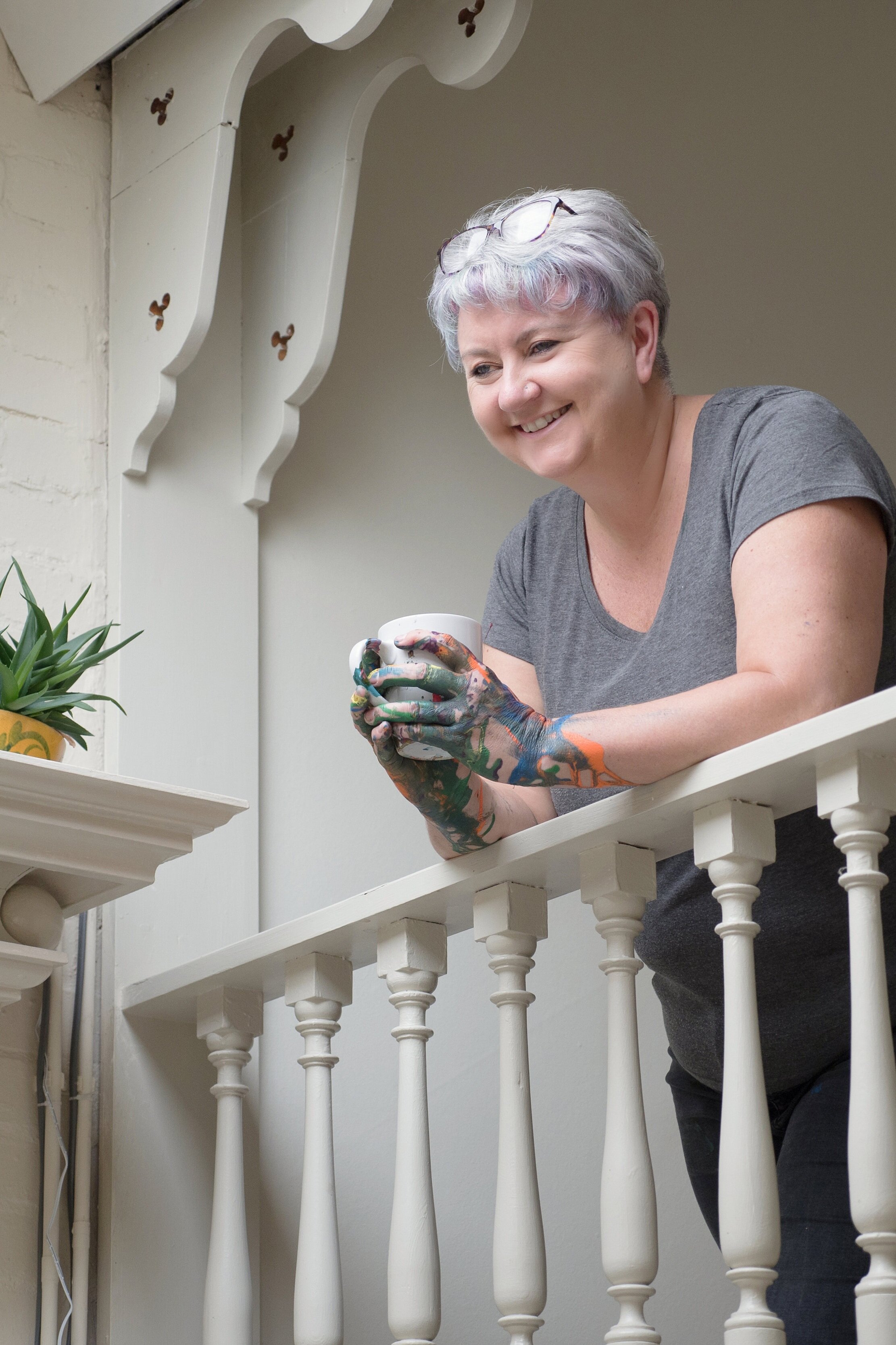
Professional Branding Photoshoot for Artist Denise Allen
by Angela Adams Photography.
deniseallen.co.uk angelaadamsphotography.co.uk
We got into some interesting situations
A very creative photoshoot for sure.
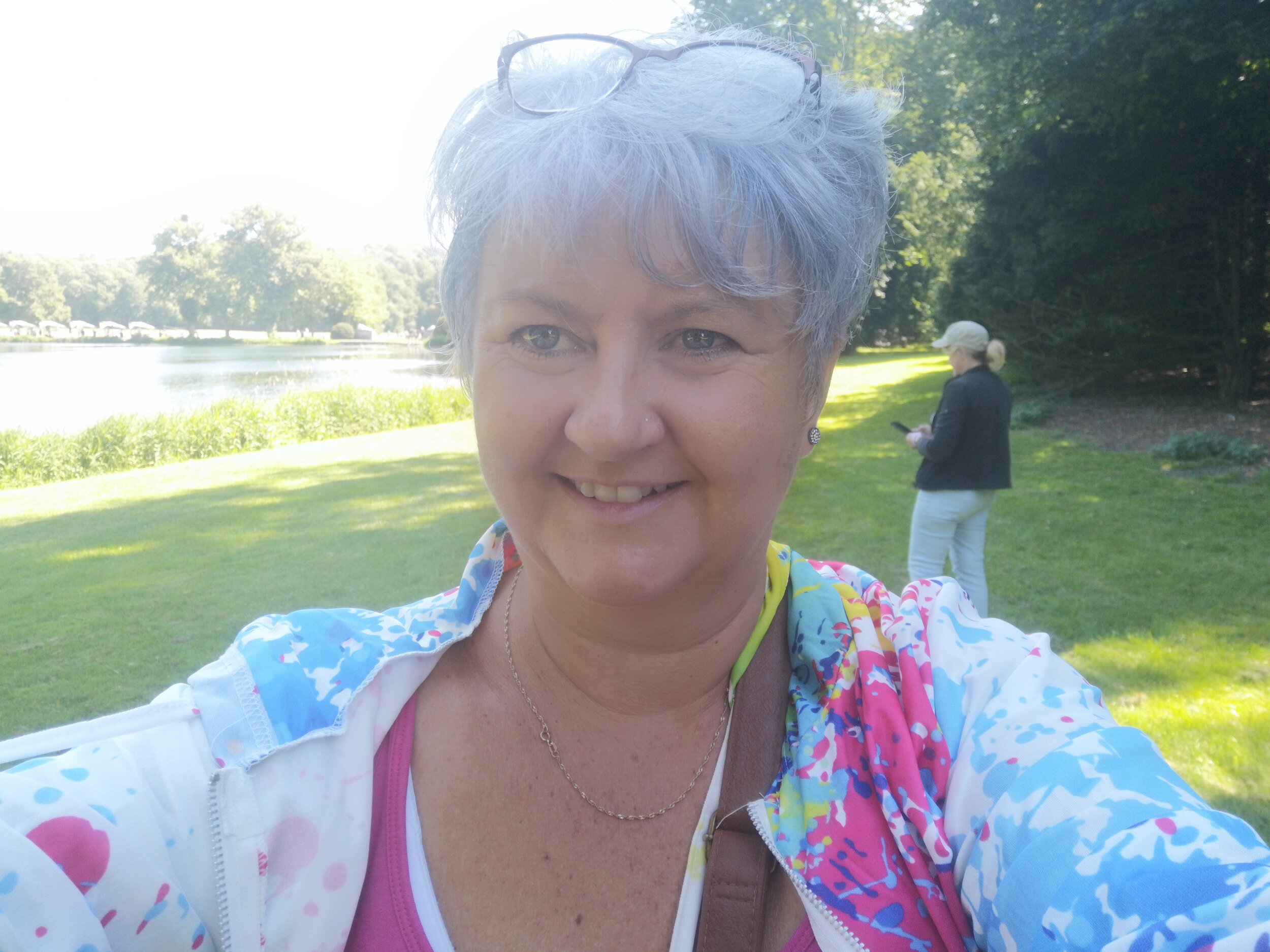
This is my snaps, not one of Angelas professional shots!
I have been wanting to rebrand and relaunch my website and social media for a while. I wasn’t sure really know where to start, or what direction to take, but this has been an idea that has been germinating throughout this very strange 2020 year.
I have known Angela for a while, since I took part in her 50 over 50 project last year. This was a wonderful session for me and other 50plus women, with the ethos of ‘capturing a beautifully natural you without hairstyling, make-up or clothing’. During that session, despite being partially clothed and without makeup Angela had made me feel at ease and we had made a connection. It was an easy decision to get in touch regarding her branding photography. But I still wasn’t sure what to expect or how it would work.
In my element
Angela Adams Photography
Angela has obviously thought this through and has set up a system to make the whole thing work. It all started with an online questionnaire asking in depth questions on how I feel about myself, my brand and what I wanted to achieve. In fact asking questions not only pertinent to the photo shoot, but things I should have asked myself about my business.
This was followed up with a prearranged phone call to discuss the results of the questionnaire. Angela had obviously read and digested my responses and knew quite a bit about my art and paintings. She already had some ideas about what we could aim for in the shoot, and had thought about the timings and order things would need to happen. I was able to add my thoughts to make it a very personal and relevant day. I was getting excited now.
The only pause was whether we would be able to run the session. The weather was necessary for some of the ideas we had. And then there was Covid 19 restrictions. Would we be allowed. We arranged a date, and kept our fingers crossed.
In the end it was all OK and we were able to go ahead. With caution and social distancing of course.
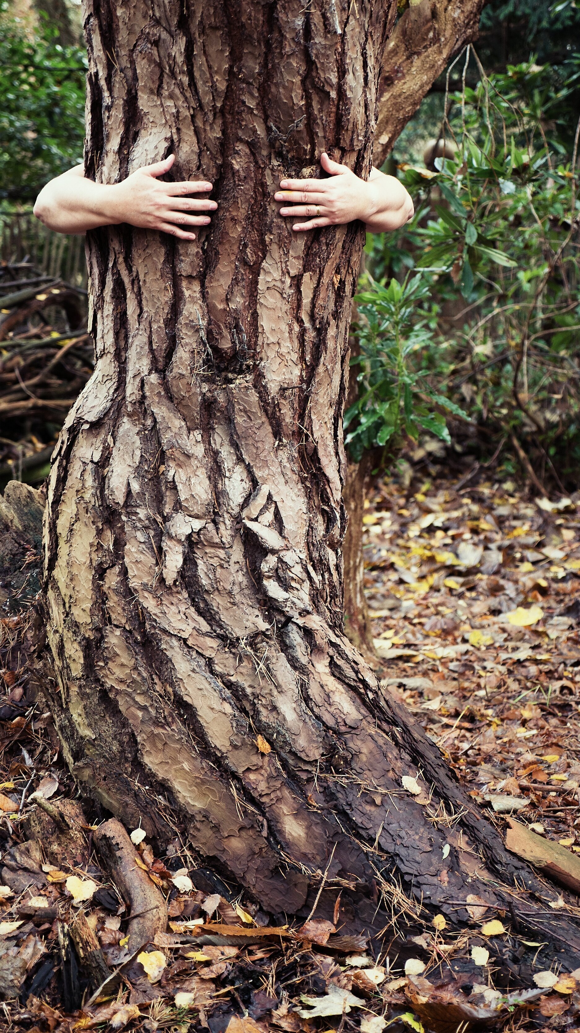
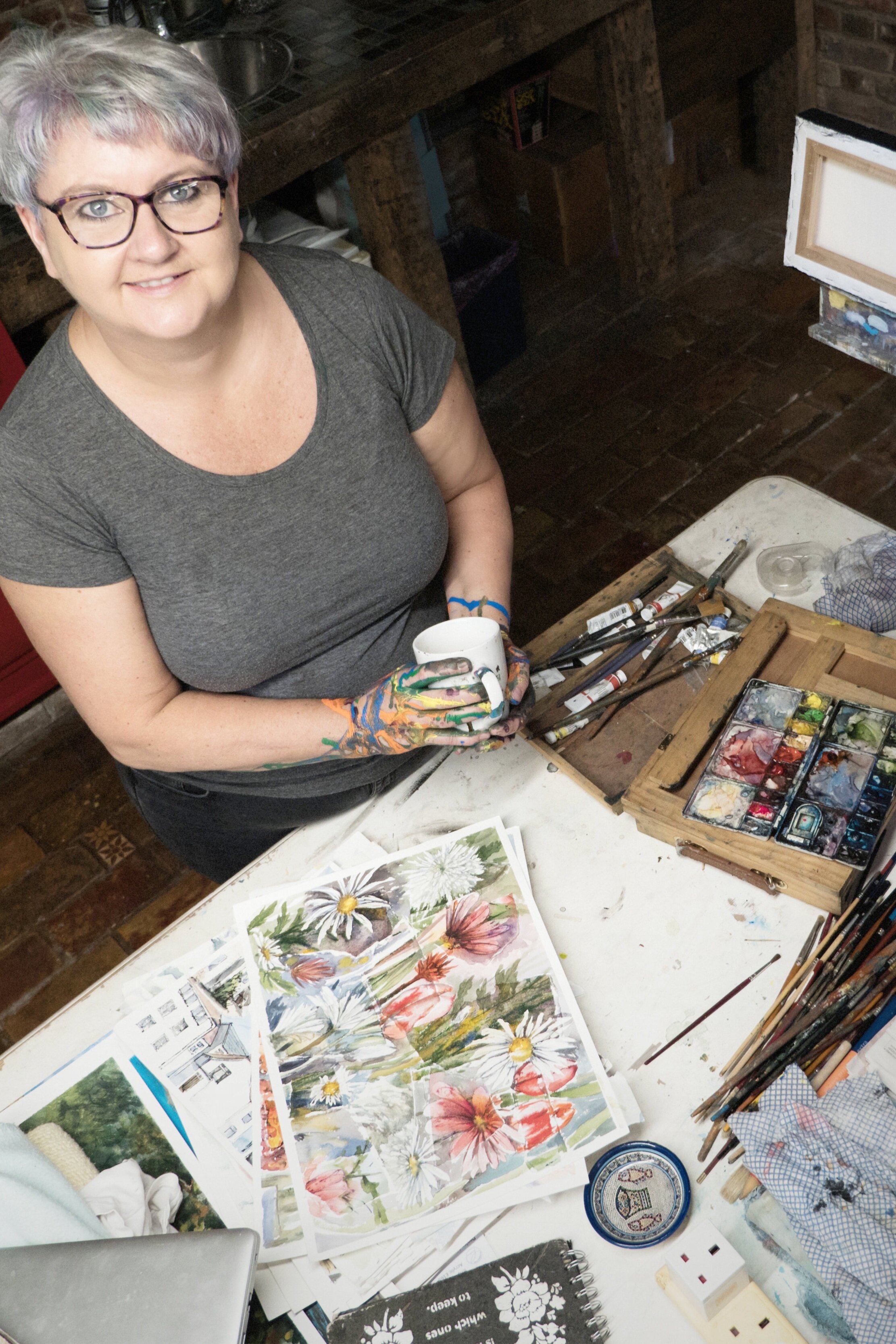
Angela had the session in her head, and we got straight to work outside while the light was so beautiful. There were some photographs of me working outside. It is something I love to do, and paint plein air whenever I can. I just happily got on with playing with my paint and Angela got on with what she does. I am very lucky to have a small woodland at our house, so we also took some shots around some of the beautiful trees we have here. No ‘leaning against a log’ shots. Angela was far more creative and had some ideas that would work very well on websites and social media. She was thinking about the end product. Clever lady.
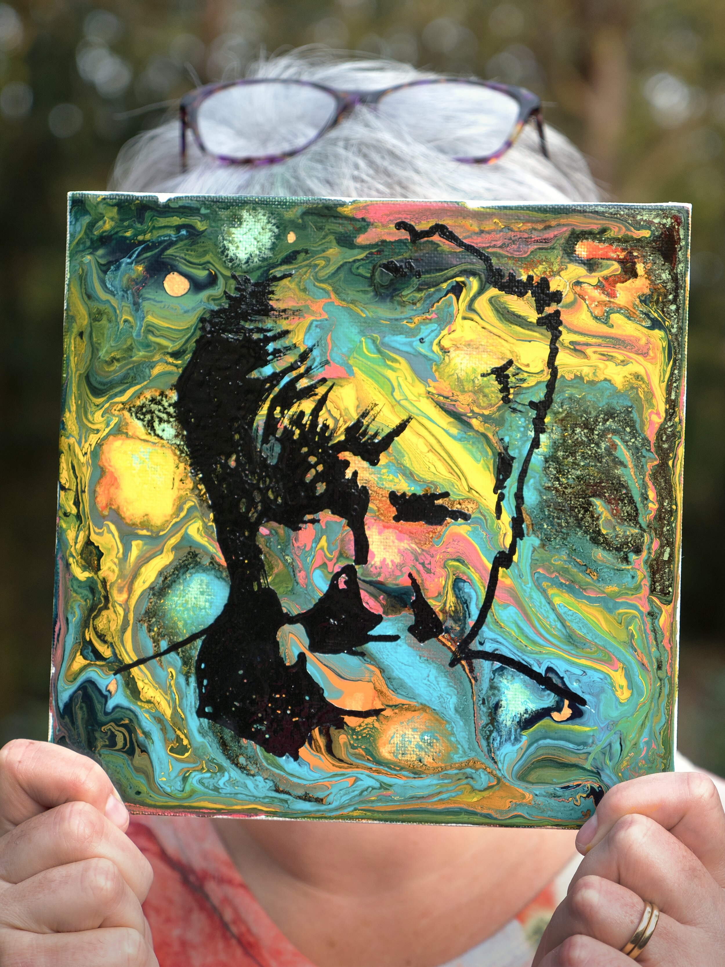
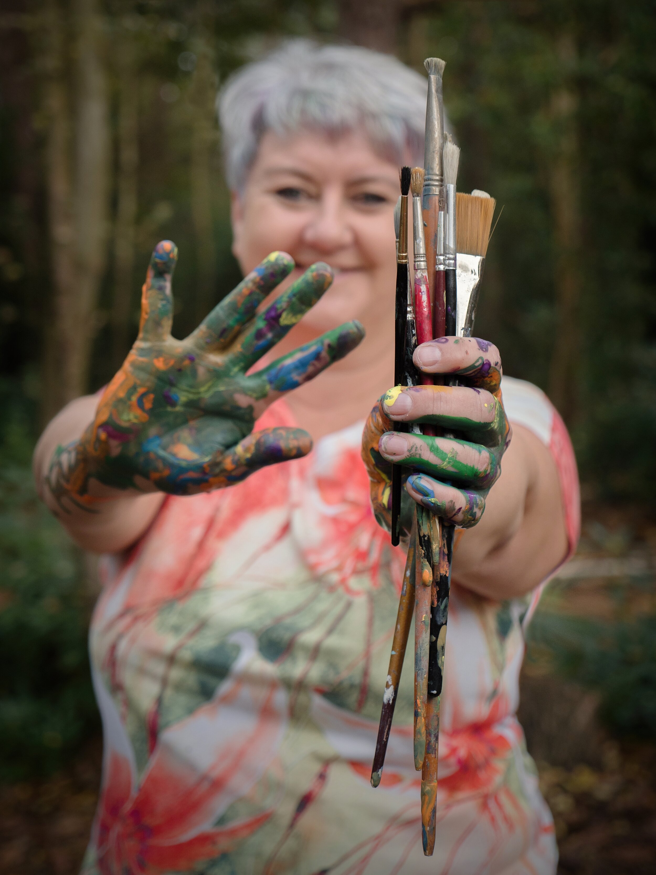
Then we got messy. As an artist I was very happy to dribble some paint around and get a bit messy. Let’s face it, I get messy most days when I am working, so this was really showing the true me.
Angela Adams Photography
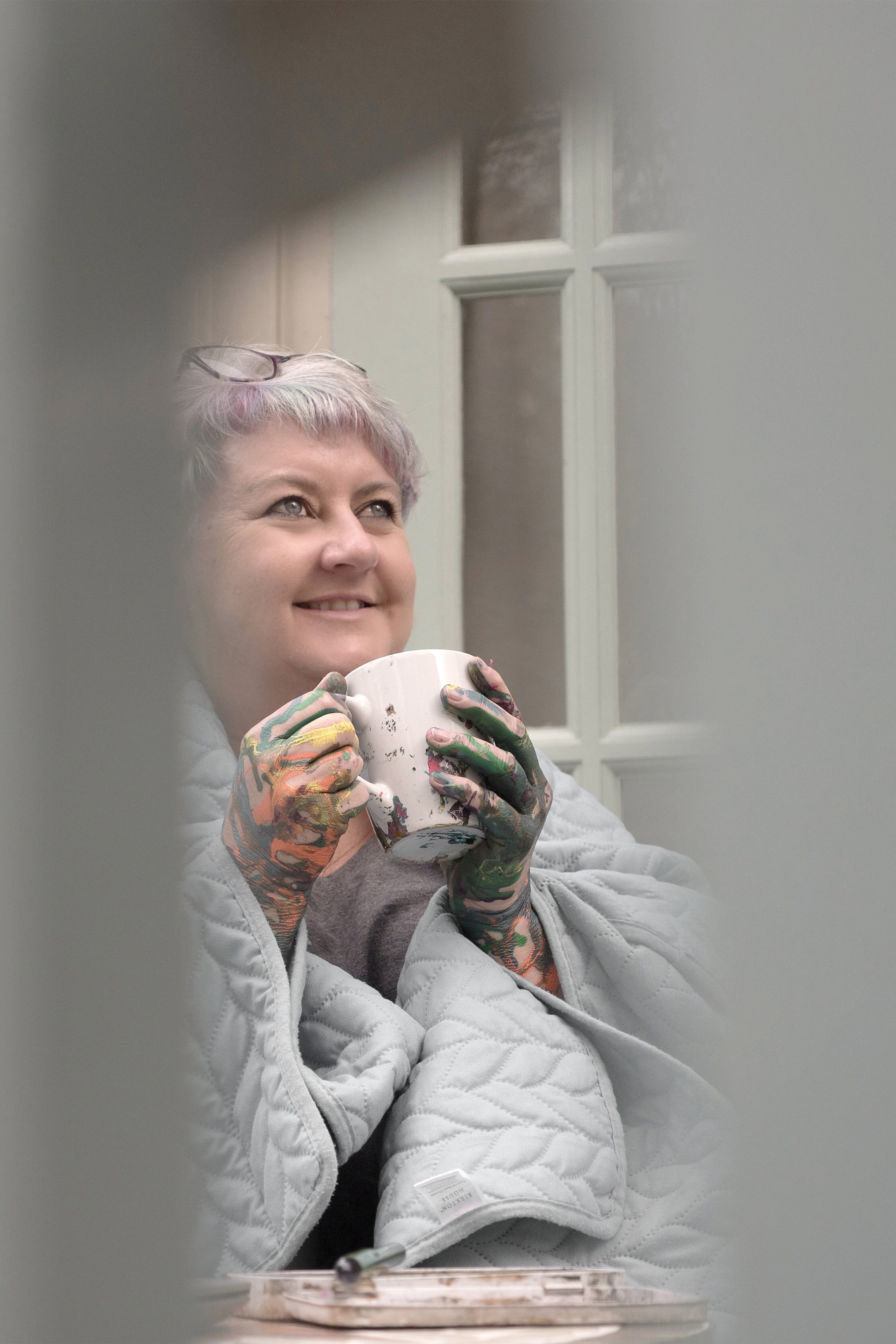
Then came a section I was a little shy of. Those who know me, know I am not really shy at all. I am happy to go live on Facebook or Youtube. I love the days when I am on live TV with the shopping channel Hochanda. I will stand in front of a room full on people and demonstrate a painting technique or subject. But all of this is the ‘professional’ me. Angela was proposing some lifestyle shots. Allowing people to get to see the private me. This was far less comfortable but we were on a roll. In the end this gave me some of my favourite shots of the day. They were so personal and intimate and I absolutely love them.
The whole session took a few hours, and I had the edited pictures within a week. I have a selection of portraits and action shots. I have some product shots and lots of pictures suitable for backgrounds in advertising. I have the most amazing lifestyle shots. And a few extras that will be so helpful in my rebranding.
Thank you Angela for making the whole session run so smoothly. I know from my teaching practice how much work you put in behind the scenes to make it all seem so easy.
